The new year brought a new look for Avalon Integration. Our logo and website have had a makeover!
The industry has changed so much over the past two decades since Avalon Integration was launched. While we’ve been riding high on the wave of evolution, we realized that our corporate appearance wasn’t reflecting our own innovation and growth.
Avalon Integration has over 20 years of service—improving efficiency in warehouse, store, and field. That’s where we come from and what we do. But who are we? Problem-solvers. Professionals who dig deep for a better way to do something. That could be making a change that helps a worker complete a task with more comfort or to prevent injuries. It could be uncovering a glitch in a process that opens the door for errors to creep in—like delays in replenishment, out-of-stocks, and missing inventory in service vehicles. Our experience gives us the advantage to go beyond cookie-cutter fixes that don’t address the unique nature of your individual operation. Most importantly, we look beyond the immediate problem to find a lasting solution, so your operation works smoothly in the long run.
We partnered with Divine Design & Marketing to refresh our corporate image. We started the process with “Why?”
Why change with a new look and why now?

It’s never a random decision to overhaul a brand. It’s our identity. The graphics and contextual presentation impact how people see us. The logo is used on everything from our website and social media to labels, invoices, packaging, and company shirts. The brand message has to be communicated throughout the business, to distinguish us from the other providers. We pondered the idea for many months but realized the change was due.
We felt the symbol we had been using wasn’t effectively demonstrating our forward-thinking approach to solving efficiency issues for the industries we serve: warehouse, distribution, manufacturing, and field service. These businesses are challenged with maximizing operational efficiency, by dramatically increasing productivity, accuracy, and speed, without cutting into profit margins. That’s not an easy task. It requires rethinking every process, dissecting each step, and then evaluating the pieces in order to rebuild the process in a more efficient way.
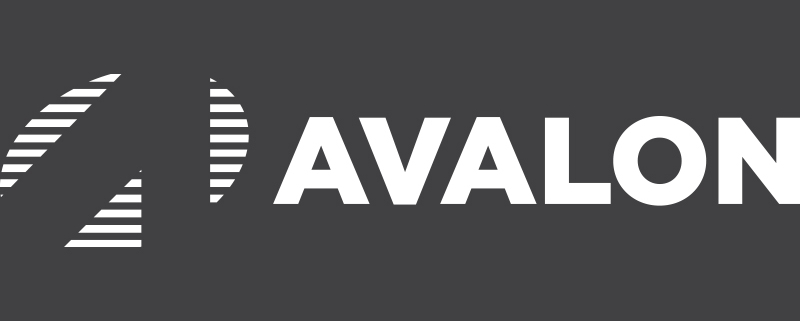
The new symbol for Avalon Integration is a stylized “A” that’s pointing in a forward direction, with lines that represent all the steps involved in completing a total solution.
With the logo redesigned, the new website is in the works. The homepage gives you a glimpse of all things Avalon—products, and services to the latest news. From here, you can click through to quickly get the information you need. We’re revamping the content, making sure everything is up-to-the-minute on technology innovations and changes that impact the industry, like the current compliance standards, IoT, wireless networking, and locationing.
After 20 years, we’re still growing, and we’ll continue to do so. Count on Avalon Integration to step up and give you what you need to stay on track and achieve your goals. Let’s see how we can get started. Contact us to arrange a free consultation.


